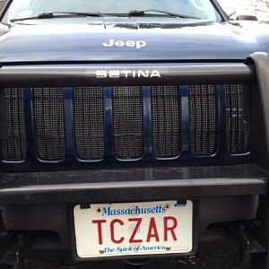
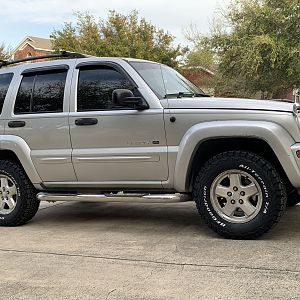
New look!

Disclaimer: Links on this page pointing to Amazon, eBay and other sites may include affiliate code. If you click them and make a purchase, we may earn a small commission.

Shaggy

Active Member
Staff member
Administrator
Joined
Mar 17, 2010
Messages
860
Reaction score
59
Location
Arizona
How do you all like the new look of the forum? Post up your feedback here. I am still tweaking things here and there, but most of it is done.
 

bheiser

Full Access Member
Joined
Dec 19, 2010
Messages
38
Reaction score
0
Location
San Francisco, CA
Hi - I think the site looks good, and have a couple suggestions/questions...
- is it possible to make the layout scale to the width of the browser? As it is now, if the browser isn't wide enough, some important parts get truncated (like the "quote" button for example).
- do you have any plans to add mobile (iPhone) support? :)

Thanks!
 

Shaggy

Active Member
Staff member
Administrator
Joined
Mar 17, 2010
Messages
860
Reaction score
59
Location
Arizona
Hi - I think the site looks good, and have a couple suggestions/questions...
- is it possible to make the layout scale to the width of the browser? As it is now, if the browser isn't wide enough, some important parts get truncated (like the "quote" button for example).
- do you have any plans to add mobile (iPhone) support? :)

Thanks!

Thats something on your side. You have to low of a display resolution on your computer. If you change it up a bit, it will all fit on your screen.
 

LibertyTC

Well-Known Member
Staff member
Moderator
Joined
Oct 24, 2008
Messages
9,095
Reaction score
1,765
Location
B.C. Canada
Very Different. The second it happened I posted under General forums, so going to tie in over there to you Shaggy.
Really do not like the KJ running left side, all the way down each section on main page. It is distracting from differentiating the sections, after all they are not all KJ sections.
 

Shaggy

Active Member
Staff member
Administrator
Joined
Mar 17, 2010
Messages
860
Reaction score
59
Location
Arizona
I may change that to something else. Not sure yet.
 

Jacob789456

Full Access Member
Joined
Nov 27, 2010
Messages
53
Reaction score
0
Location
San Diego, CA
Not bad, not bad, used to the old style, but the layout of this new one is very user friendly and is much "cleaner" and more organized than some forums.
 

hyde

Moderator
KJ Supporting Member
Joined
Feb 15, 2006
Messages
7,347
Reaction score
7
It's OK but brown is too much like jeepforum.
No more mountains? Also are you planning to remove the splash page at domain root with vbportal?
 

Shaggy

Active Member
Staff member
Administrator
Joined
Mar 17, 2010
Messages
860
Reaction score
59
Location
Arizona
Yes I plan I doing something with the splash page. I think this color is so far way from the color of jeep forum. They are green, no where near the color we got.
 

huntbuggy

Full Access Member
Joined
Dec 19, 2010
Messages
215
Reaction score
0
Location
Ottawa, Canada
Ack. The pale greys in the scheme are pretty rough on my netbook.

Guess JEEPKJ will only get me to check once every now and again on a proper screen.
 

Shaggy

Active Member
Staff member
Administrator
Joined
Mar 17, 2010
Messages
860
Reaction score
59
Location
Arizona
Don't worry, you all will get the chance to go back to the older look. I just want to leave this up for a few days so you guys can get a look at it. If you don't like it after the few days, you can go back to the older version.
 

twack

Full Access Member
Joined
Mar 3, 2009
Messages
1,131
Reaction score
5
Location
rochester mn
at first i was like WTF then it started to grow on me. but it will take awhile. the colors feel to much like lost to me. can we get some options?
 
Top